The Leadsleap landing page builder gives you a lot of flexibility in controlling how your page appears across various devices.
Each landing page you create is built on a “row” and “column” basis. The landing page will adapt to whatever device it is viewed on.
Control How Columns “Collapse” On Mobile Devices
Now you can gain even more control over the appearance of your landing page when viewed on mobile devices by setting the order in which columns in any row will collapse.
For example, if one row has a column with a video next to a column with an opt-in form, you can control whether the video appears above the opt-in form, or the opt-in form appears above the video when viewed on a mobile phone. In this image from Kenneth Koh’s blog post, the two columns collapse so that the video is above the opt-in form on the mobile device:

My Video Demo
In the example I use in the video, I show how two columns of bullet points can be controlled when they collapse into a single column on a mobile device.
In short, you can control which column “collapses” above which.
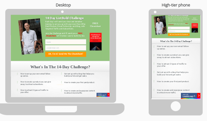
In this image you can see the difference between how one of my Leadsleap landing pages appears when viewed on a desktop and on a mobile device:

As you can see, the difference is in the appearance of the bullet points. What you can control is which column of bullet points appears above which. You could set it as I have, so that the left column appears above the right column when viewed on a mobile device, OR so that the right column appears above the left column.
In this video I show you how to do it. It’s easy to do and gives you even more control over the appearance of your landing pages on mobile phones.
The video was inspired by Kenneth Koh’s latest blog post about Leadsleap mobile-responsive landing pages: https://leadsleap.com/blog/how-to-make-landing-pages-mobile-responsive/
Not yet taking advantage of Leadsleap marketing tools? Get started free today: https://leadsleap.com/?r=hirohurl
Cheers!
David Hurley
#InspiredFocus

Leave a Reply